

Before I left on migration, I managed to squeeze in a quick presentation on all of the migration analysis work I've been doing. Essentially, here's what I found so far:
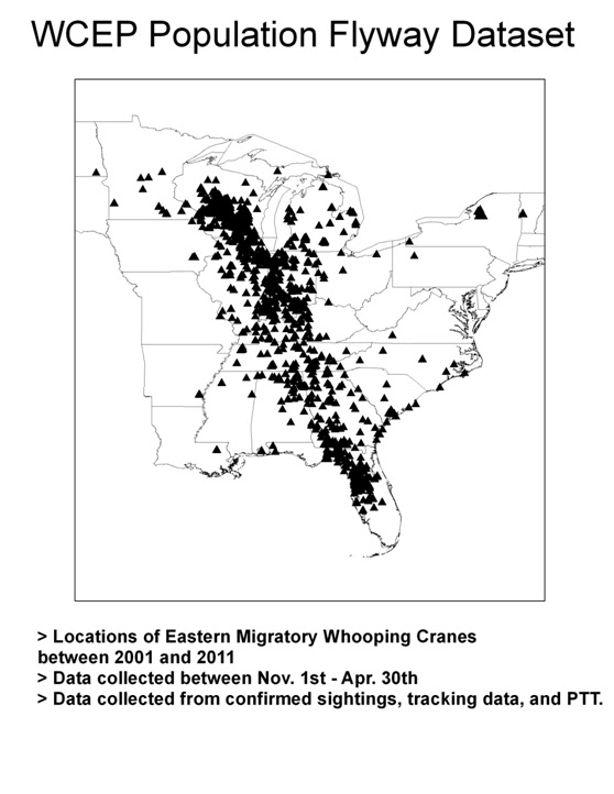

Based on a paper by Tacha, et. al. I created an average fly line using all the points. Well, actually I made two, the first fly line (orange) was waaay too jagged for my purposes. The second (blue), using almost twice as many data points for the average was smoother and more suitable to my purpose.

This was my final choice for the fly line.
After that, I wanted to find what percentage of the population was using land near the average fly line. Are all of the birds using this basic route? are half the birds using this route?
So I calculated what percent of the birds were within a certain distance from the line. It looks like this.

In an effort to remove the skew, I didn't address Wisconsin and Florida at all in my next set of calculations:

As you can see, I still have some work to do. I would like to include Wisconsin and Florida without skewing the data, and I would like to have a solid product to leave the Crane Foundation with when my internship is through.
I hope I didn't bore you with too much science. Here are some pretty crane flight pictures that I included in my presentation. These are all provided by Eva.


No comments:
Post a Comment